Comfortaa
BoldЦифра
Clean, balanced and friendly. Designed for screens and suited to software companies; its “o” is part of the symbol.
Case study 03Corporate identity · IT for the public sector
Rebranding for a public-sector IT company
An IT company from Siberia builds software and digitises processes for government ministries. After a reorganisation it got a clearly structured identity and a symbol with five layers of meaning, from logo to web portal.
01Background
Digital Development Center is a reorganised IT company from Krasnoyarsk. It builds its own software and digitises processes in the public sector, for clients such as the Ministry of IT and Communications and the Ministry of Transport.
The local market had two extremes: IT studios leaning into almost gimmicky playfulness, and others as rigid and generic as any company outside tech. The new brand had to sit in between: clear, structured and professional, yet human and approachable.
I knew the company from the inside. As a systems analyst I worked out business processes and requirements for government software; after the reorganisation my role grew to include UX/UI and graphic design. This rebranding concept came out of both perspectives.
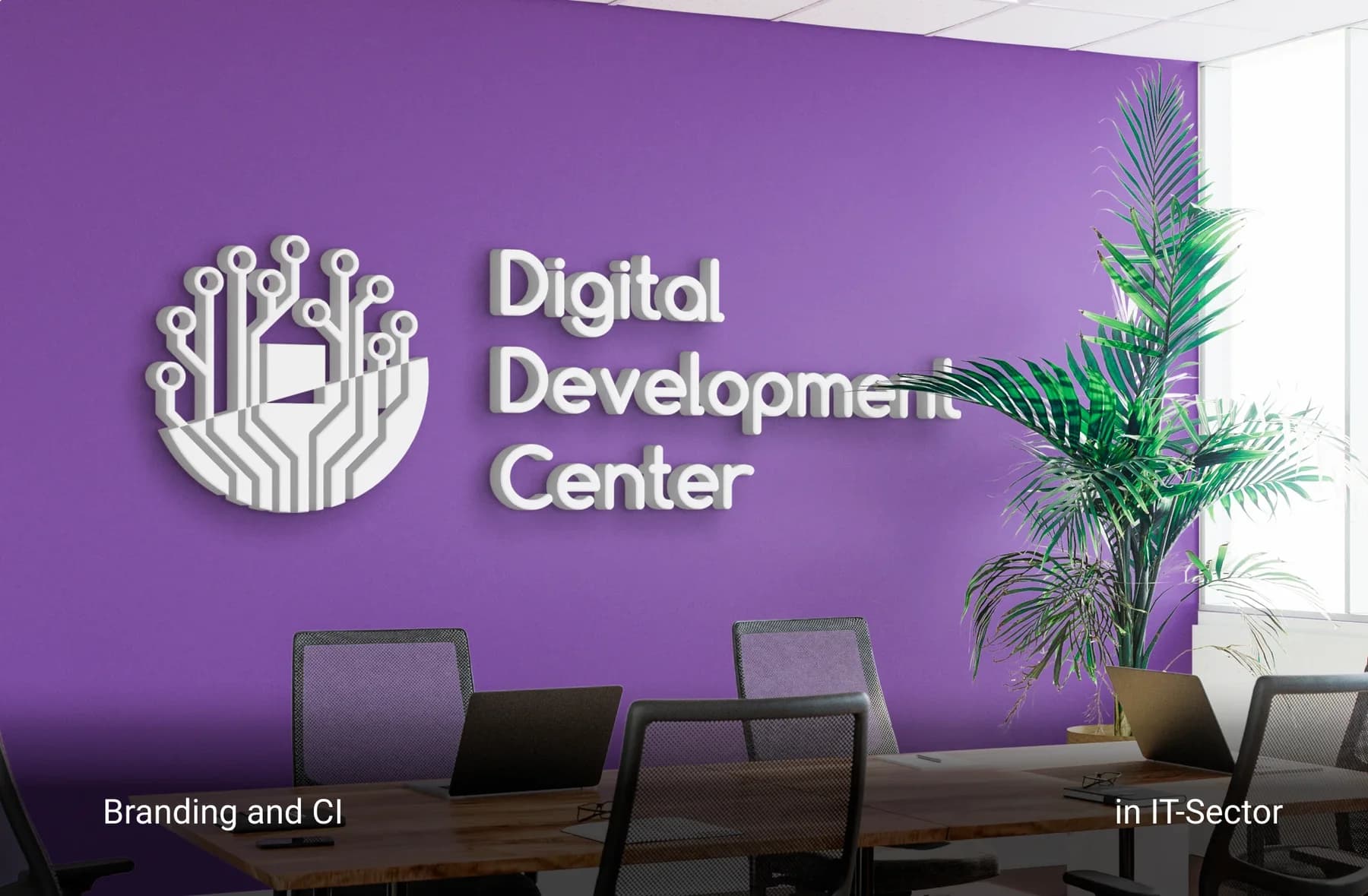
02Tasks & execution
The brief: modern corporate branding for the local market, stationery with merchandise, and a company website.
03Symbol
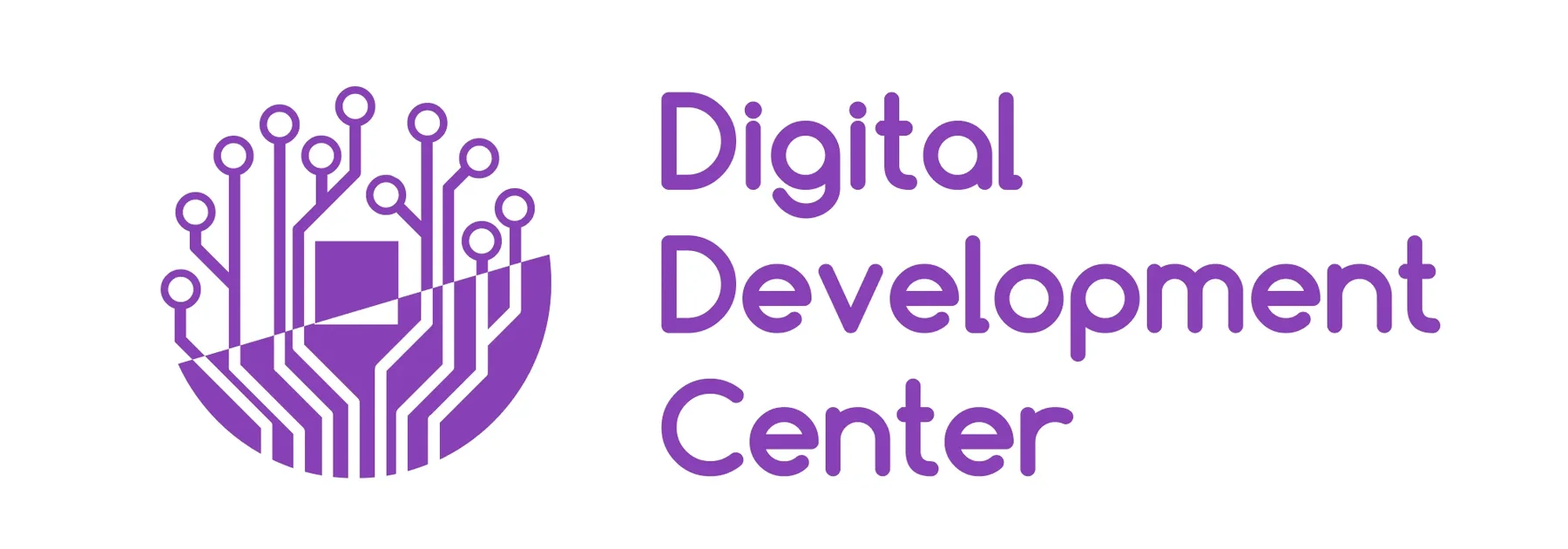
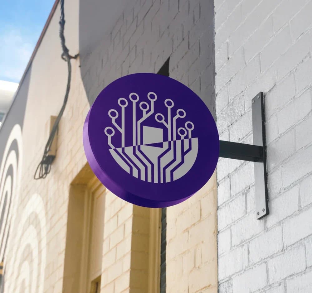
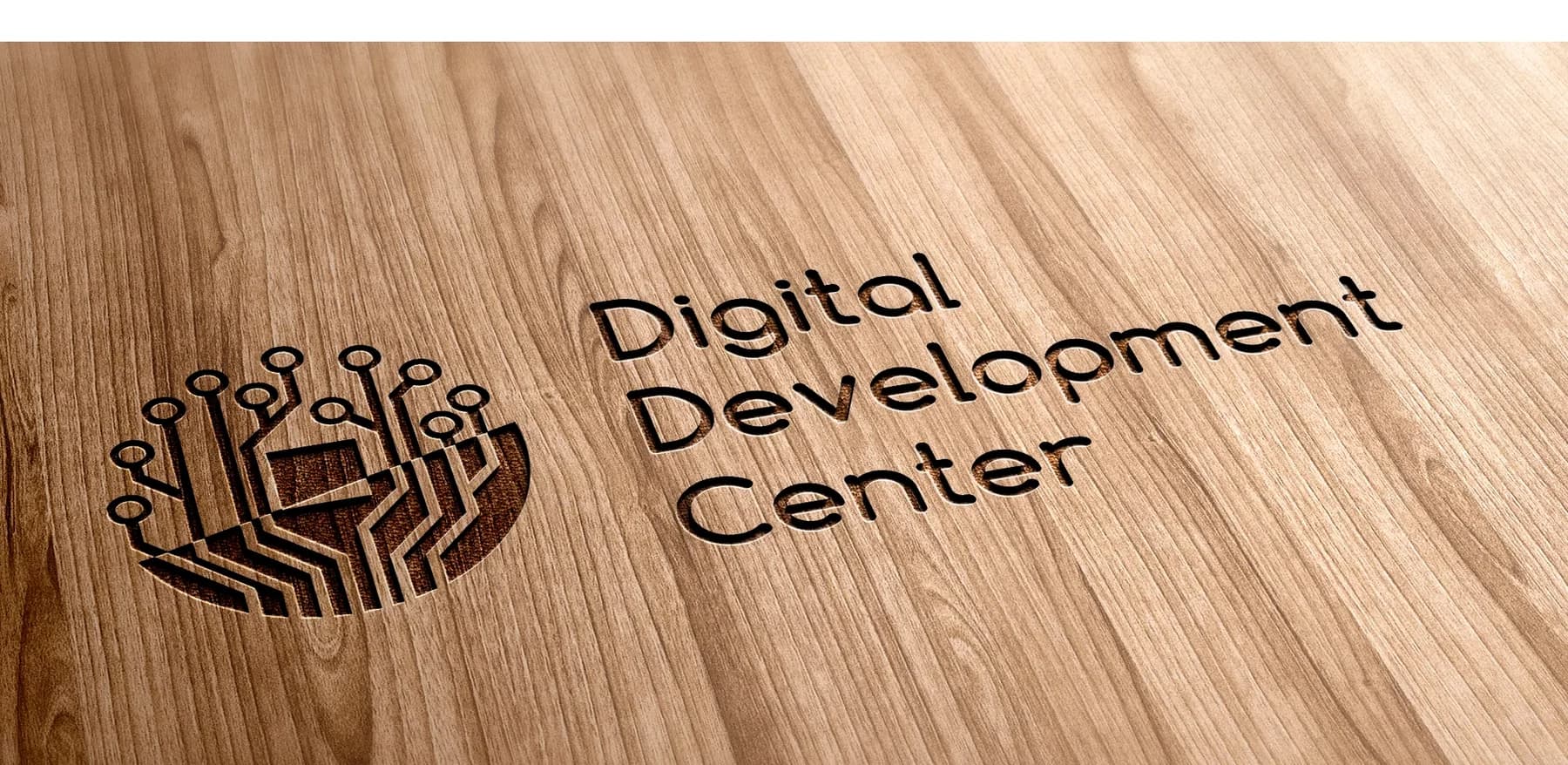
The symbol joins five motifs in one form. It is meant to feel alive and approachable, almost a good-luck charm for the company's new phase, while staying clear, structured and professional.
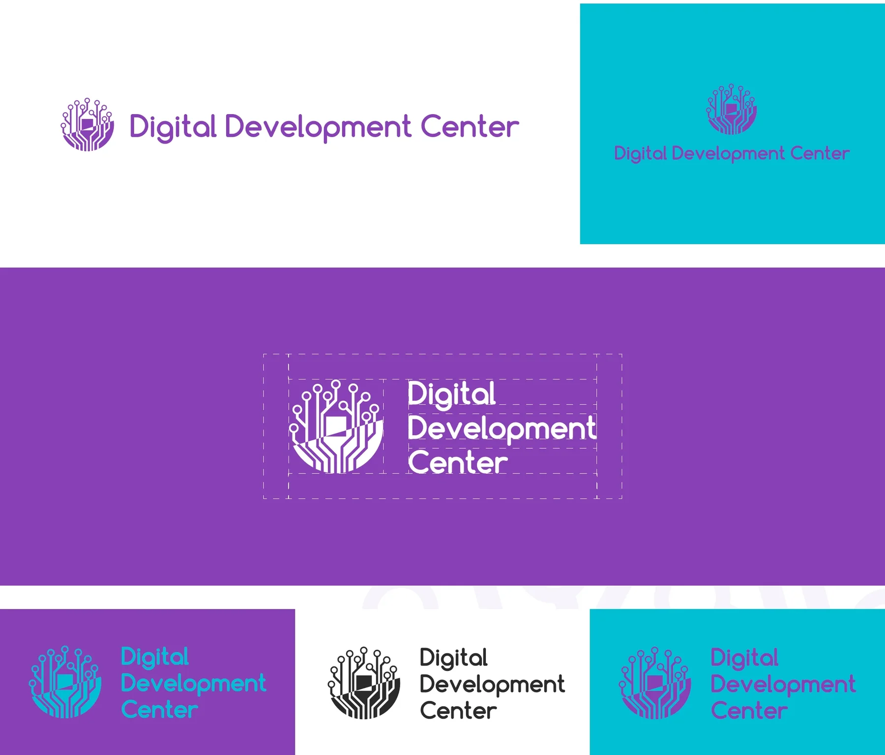
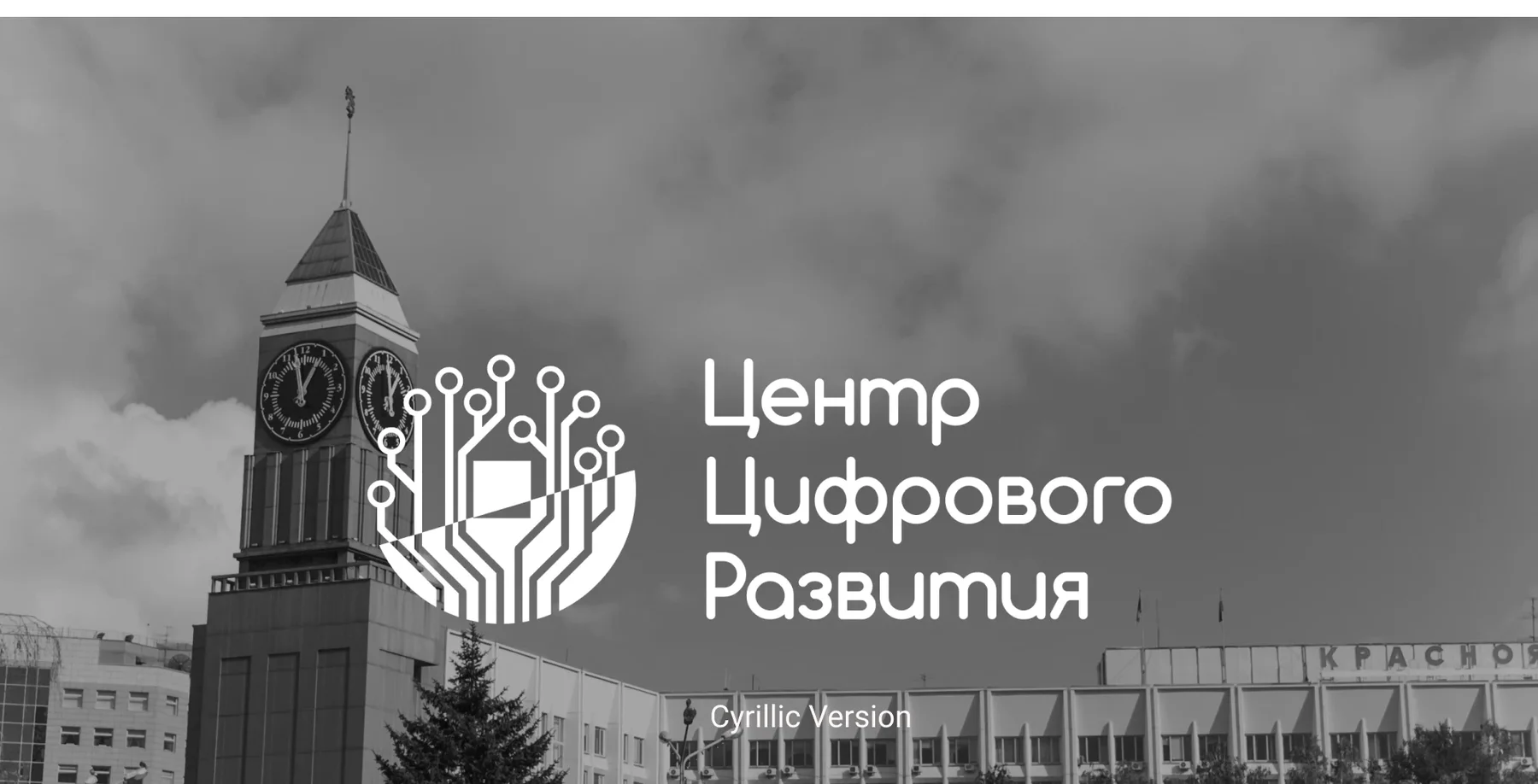
The wordmark is set in rounded Comfortaa; its “o” is fitted exactly into the symbol and forms the base of the microchip. There are horizontal and stacked versions, variants in purple, white and turquoise, and a Cyrillic version for the local market.
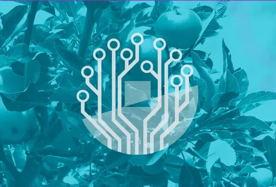
Productivity and sustainable growth.
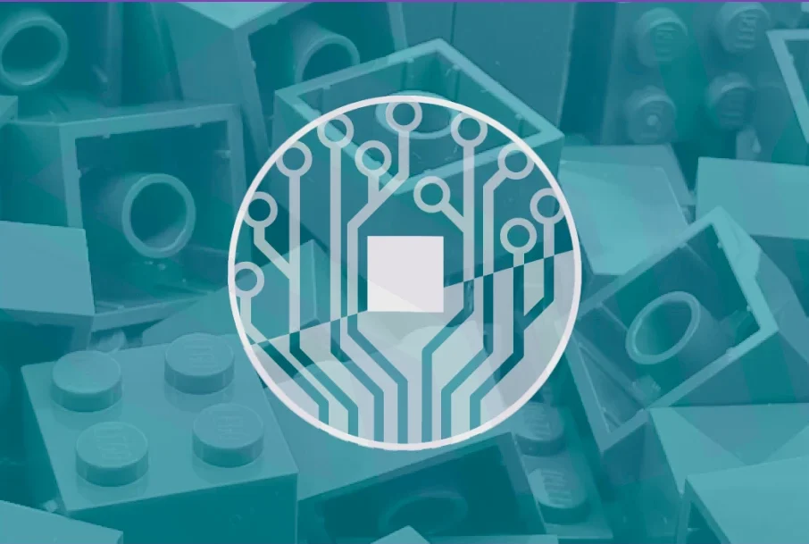
The stability and structure of a square, the integrity and continuity of a circle, together.
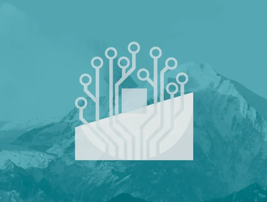
Ambitious goals and strategic vision. In Russian, a business “is going uphill” when it grows steadily.
IT and software.
Success, business luck and commerce, after the feng shui tradition.
04Colour & typography
A rich purple reads as elegant, premium and intellectual. On the Russian market it also stands for creativity and dignity; the dark shade recalls classic navy and brings seriousness and solidity.
Light turquoise stands for freshness, clarity and openness, for calm and technological relevance, and in a modern identity also for trust and sustainability. Graphite and white carry text and surfaces.
Clean, balanced and friendly. Designed for screens and suited to software companies; its “o” is part of the symbol.
05Stationery
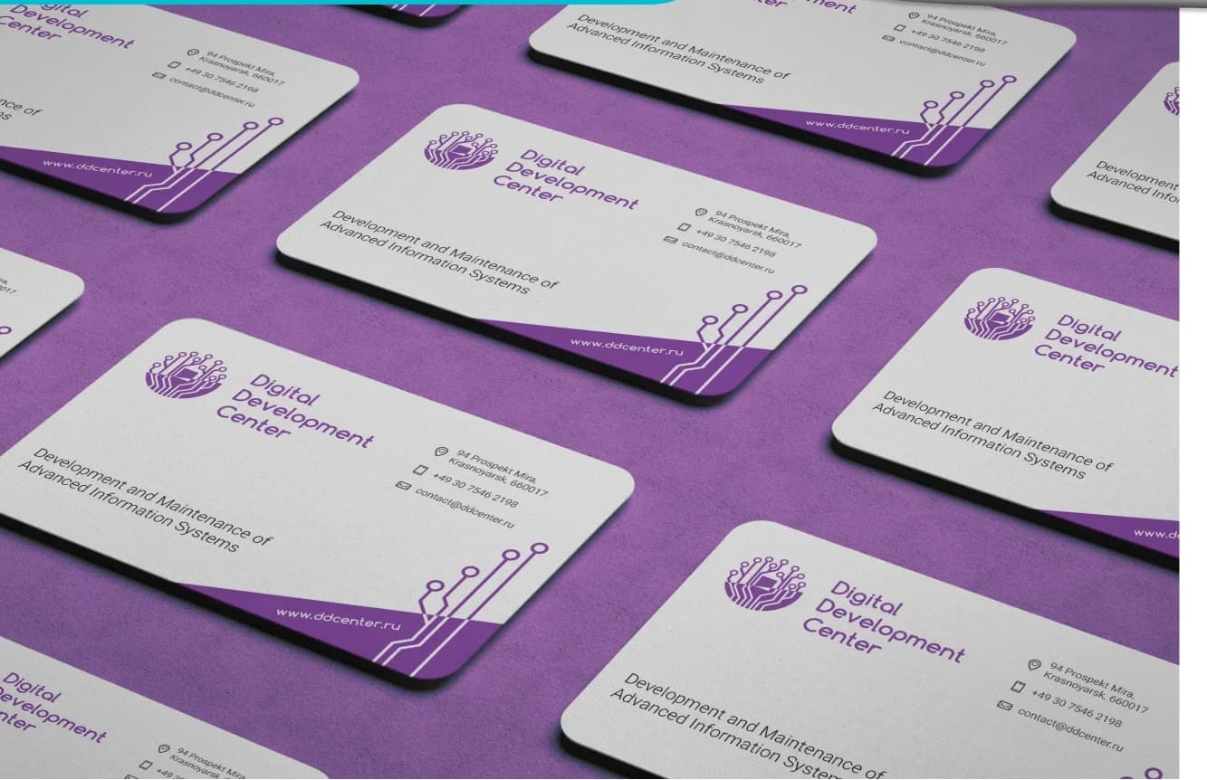
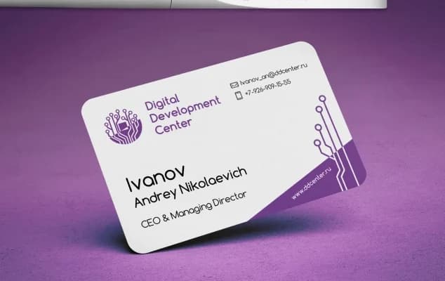
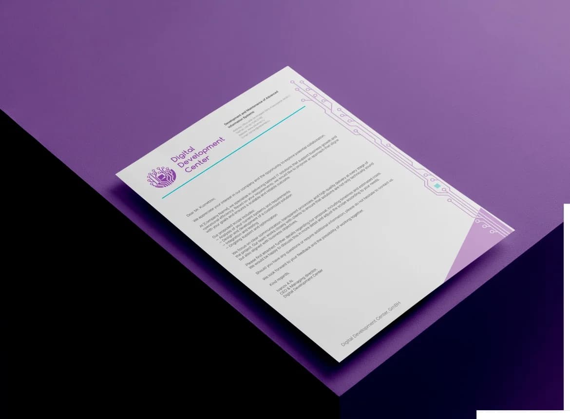
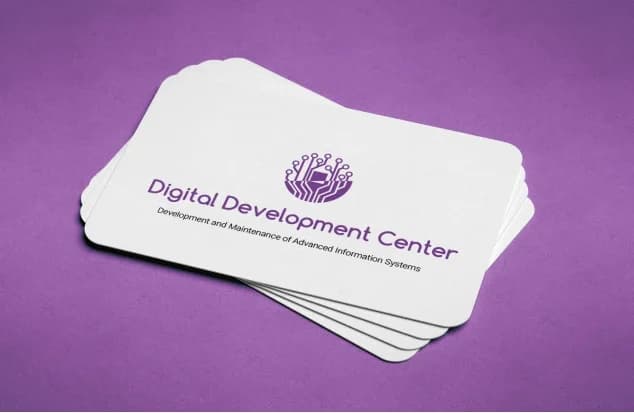
Named business cards for management and letterheads for official documents. The traces and nodes from the logo become graphic elements in their own right, so the brand stays recognisable on paper and objects.
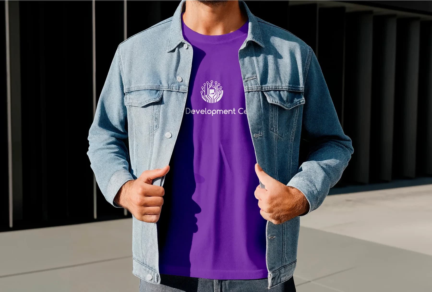
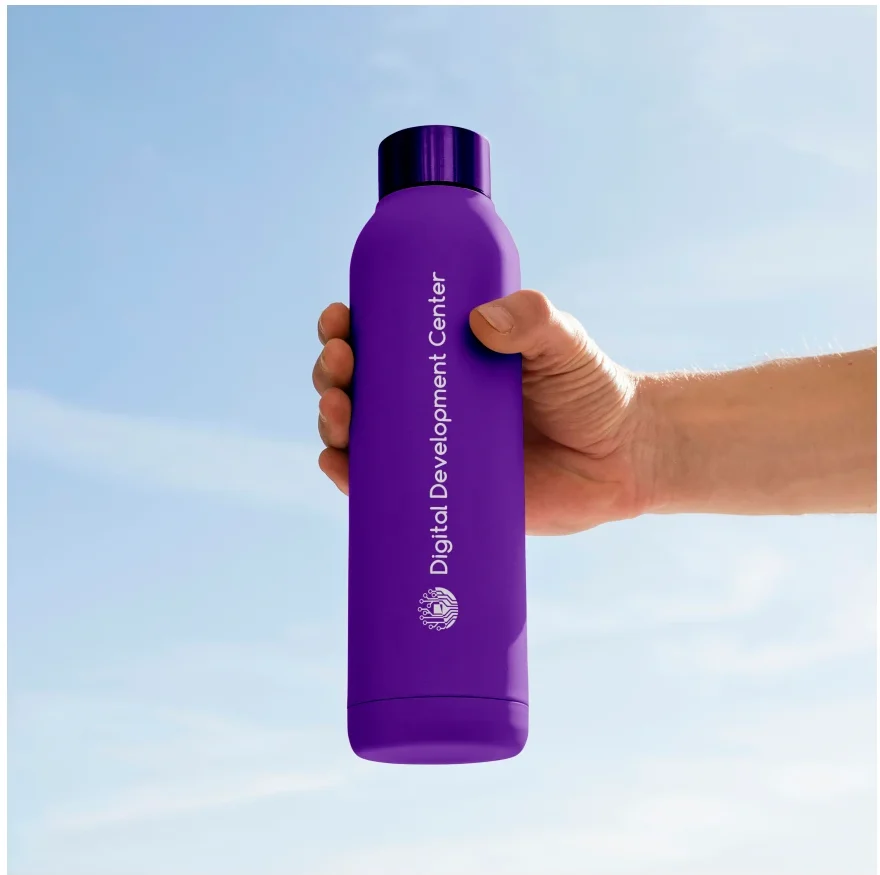
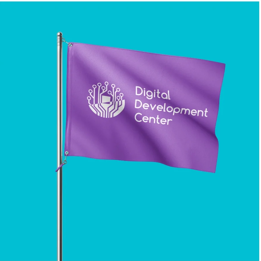
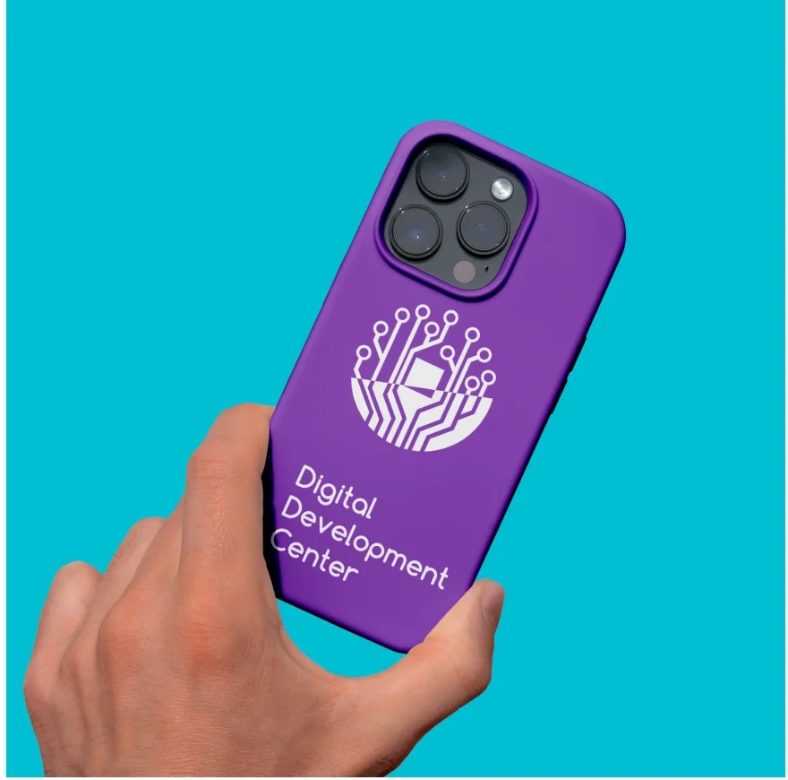
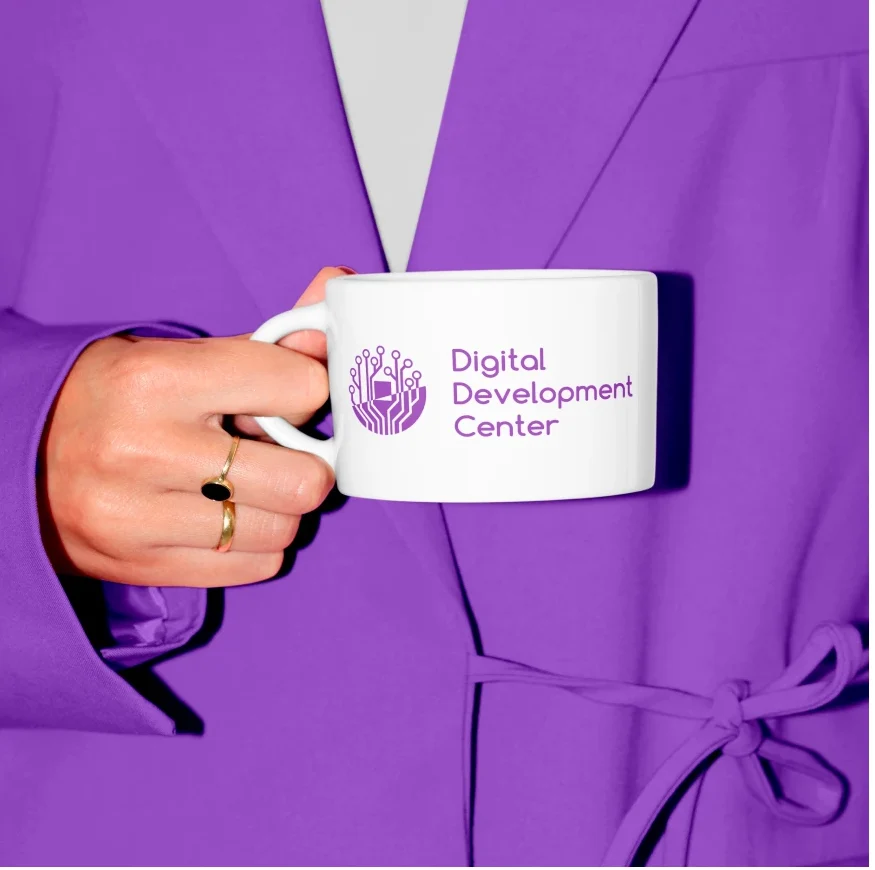
Plus merchandise for the team and events: T-shirts, water bottles, mugs, flags and phone cases in purple and turquoise.
06Signage
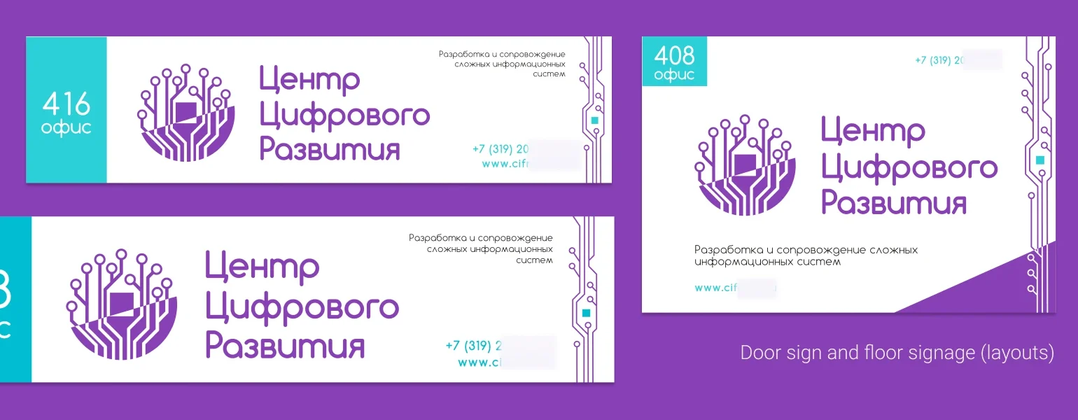
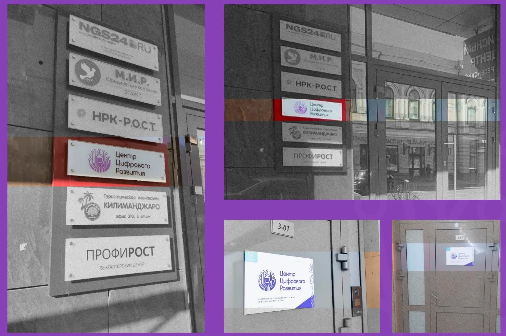
Door and floor signs with room number and the Cyrillic company name: first as layouts, then produced and mounted in the office building among the other tenants' signs. The identity shows up in everyday use, not just in the presentation.
07Web portal
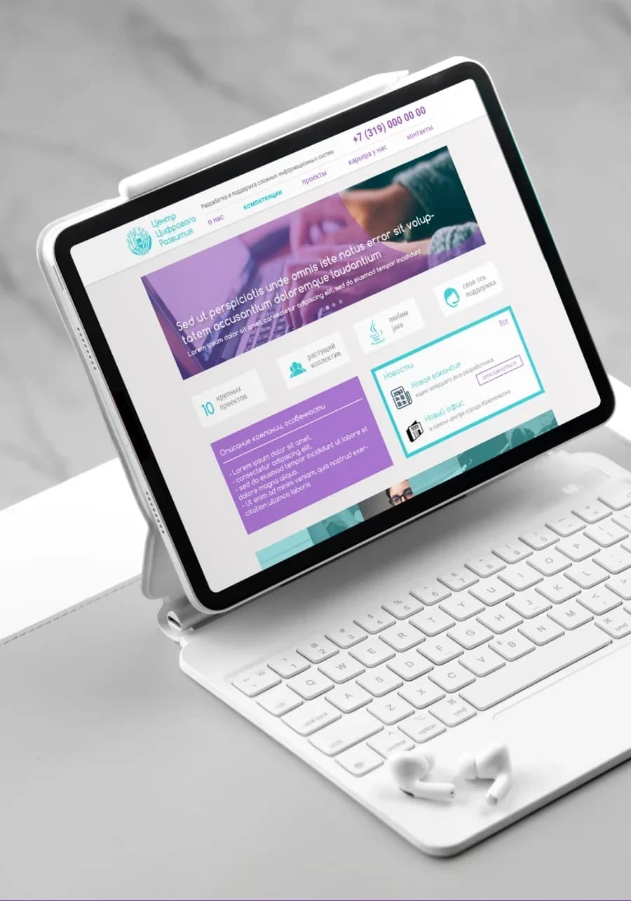
A structured, multi-page portal developed as an extension of the identity: custom, task-driven layouts instead of template blocks, and a page structure built around the company's needs, with Home, About, Projects, Competencies, Careers and Contact.
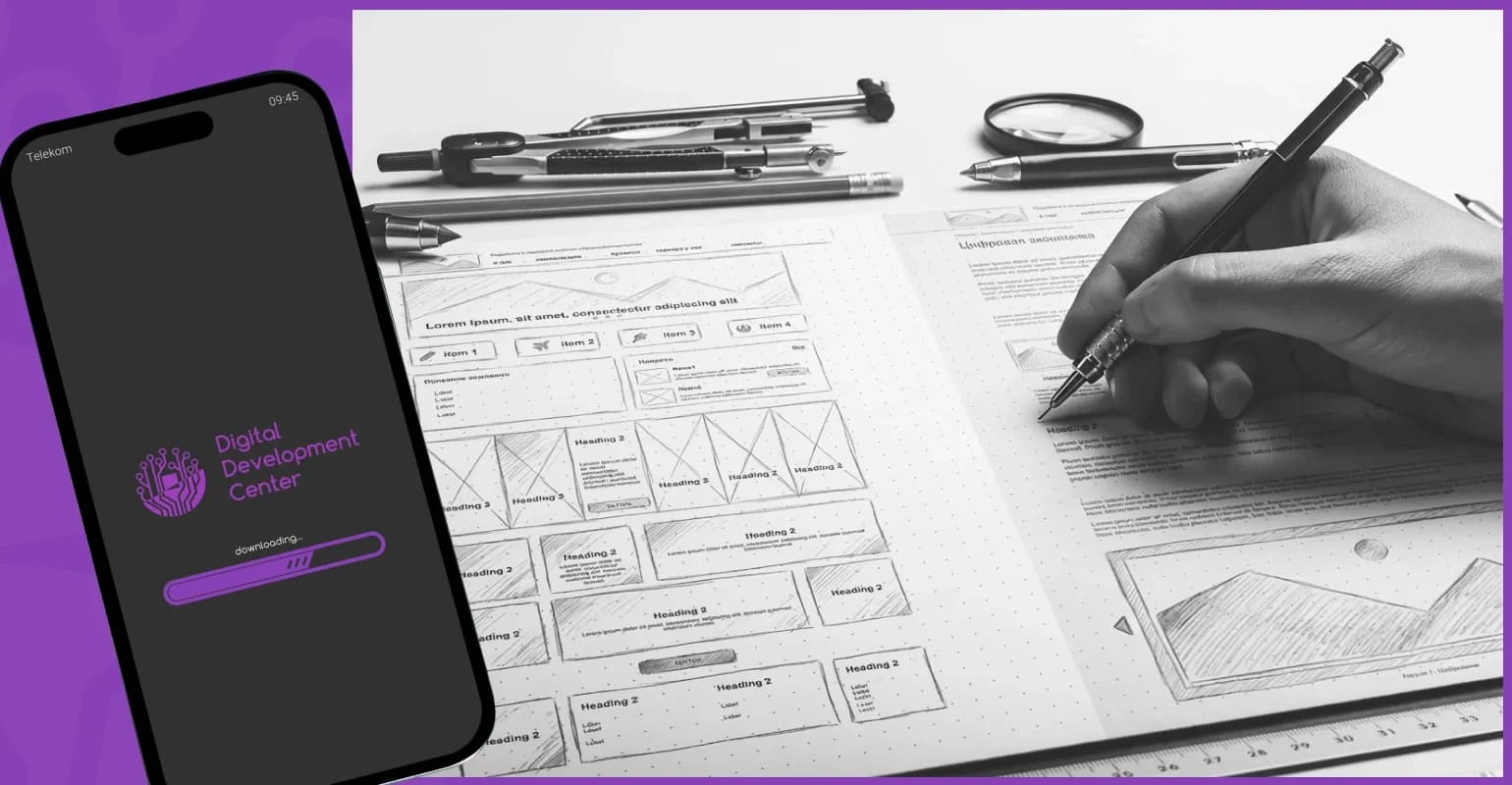
This is where my background in systems analysis and UX/UI comes in: information architecture, wireframes and early prototypes were as much part of the work as the visual design.
08Skills